Back to Lecture Thumbnails

skim
skim
Fixed link: Comic Sans Article

epark27
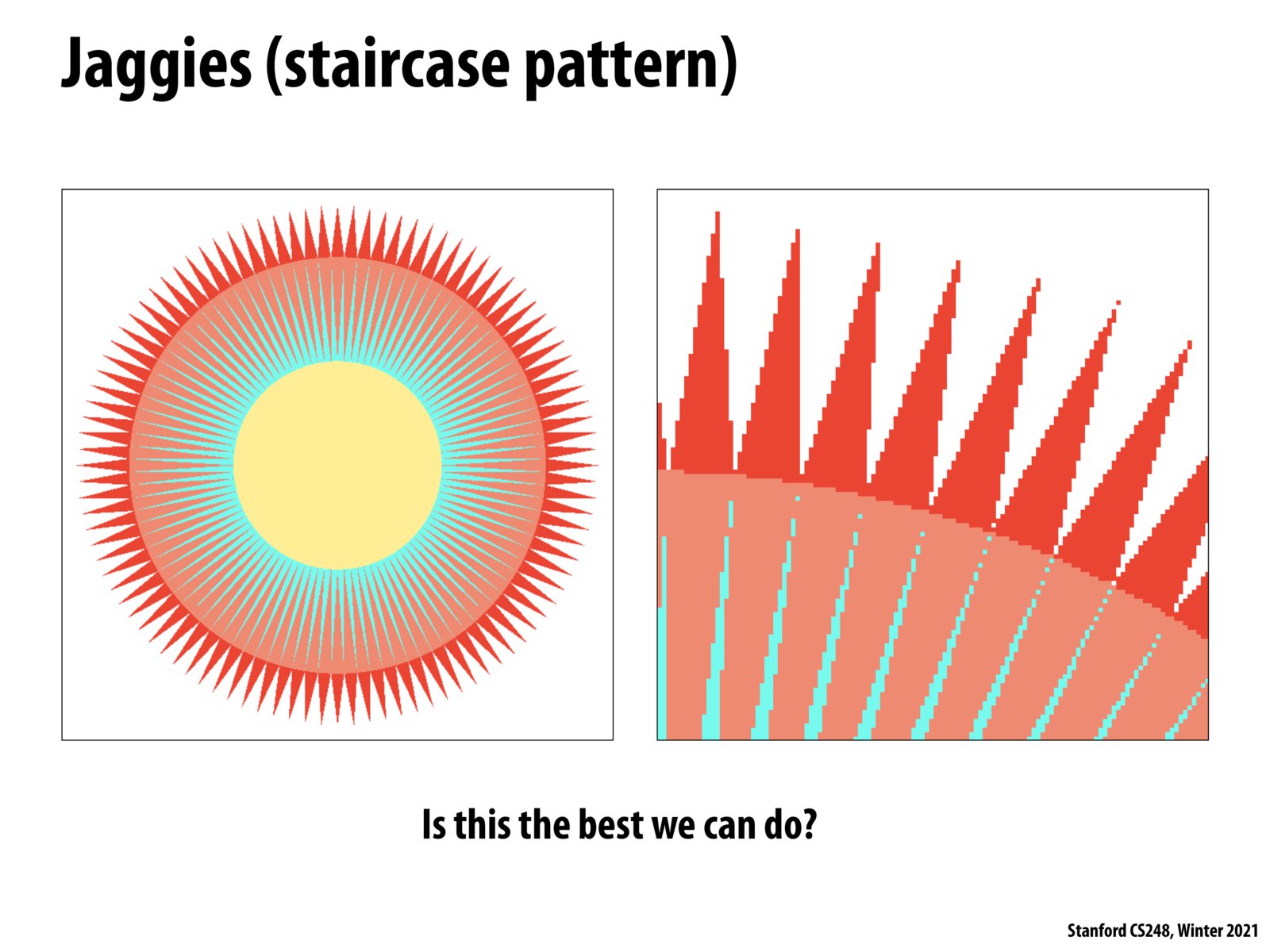
Jaggies, the bane of every digital artists existence...there's a reason that people always tell you to vectorize images that are going to be rescaled constantly - like logos.
Please log in to leave a comment.
For all of its aesthetic faults, Comic Sans actually holds some merit - it was designed to be more readable on an aliased display. See https://designforhackers.com/blog/comic-sans-hate/